
equ
Protein powder has a type.
equ decided to change that.
Amal Wakim built equ on a simple but powerful idea: that eating well should never feel like a punishment. What started as Equalution, a nutrition app trusted by over 60,000 members across Australia, had grown into one of the country's most credible health tech platforms, with a community of people who genuinely understood the difference between wellness and deprivation.
When Amal was ready to extend that brand into a physical consumer product range of protein powders, supplements and vitamins, the audience was already there. The challenge was making sure the products looked like they belonged in the same world as the brand those 60,000 people already trusted
PACKAGING DESIGN
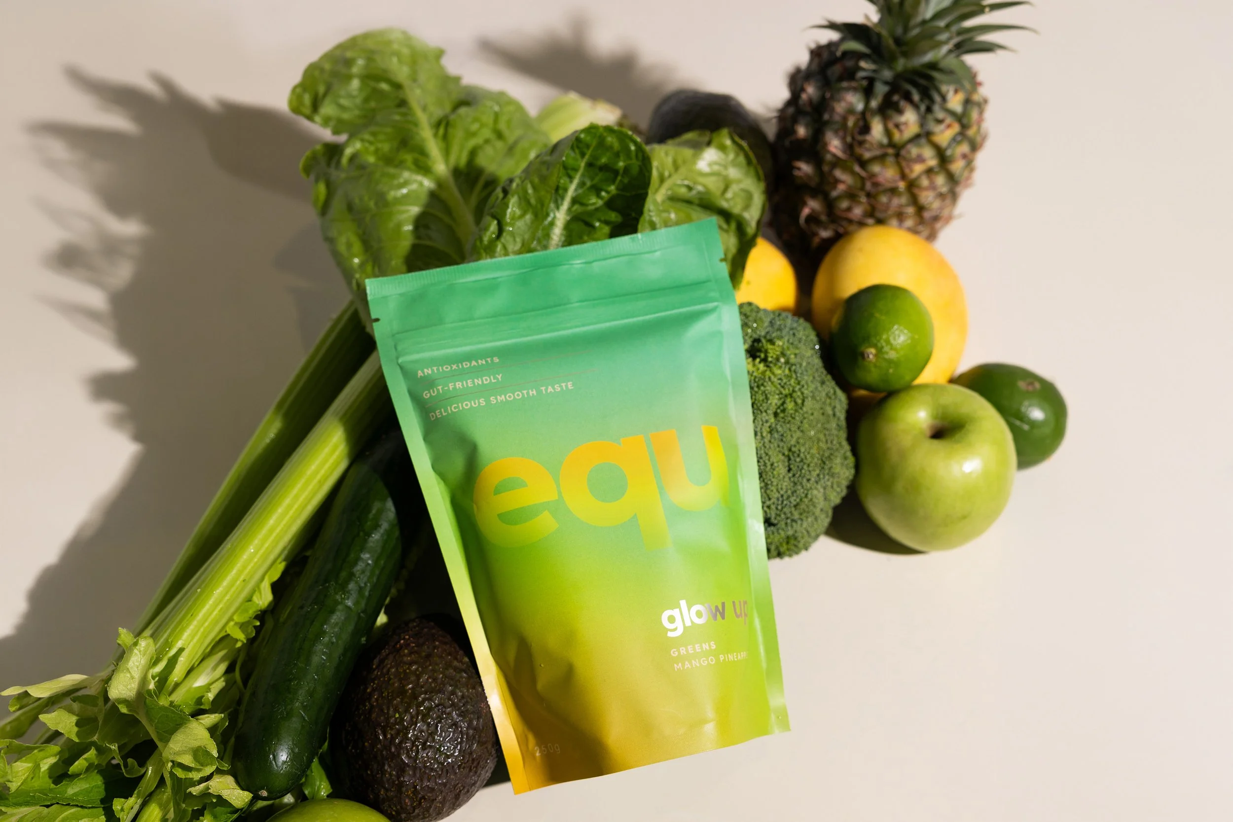
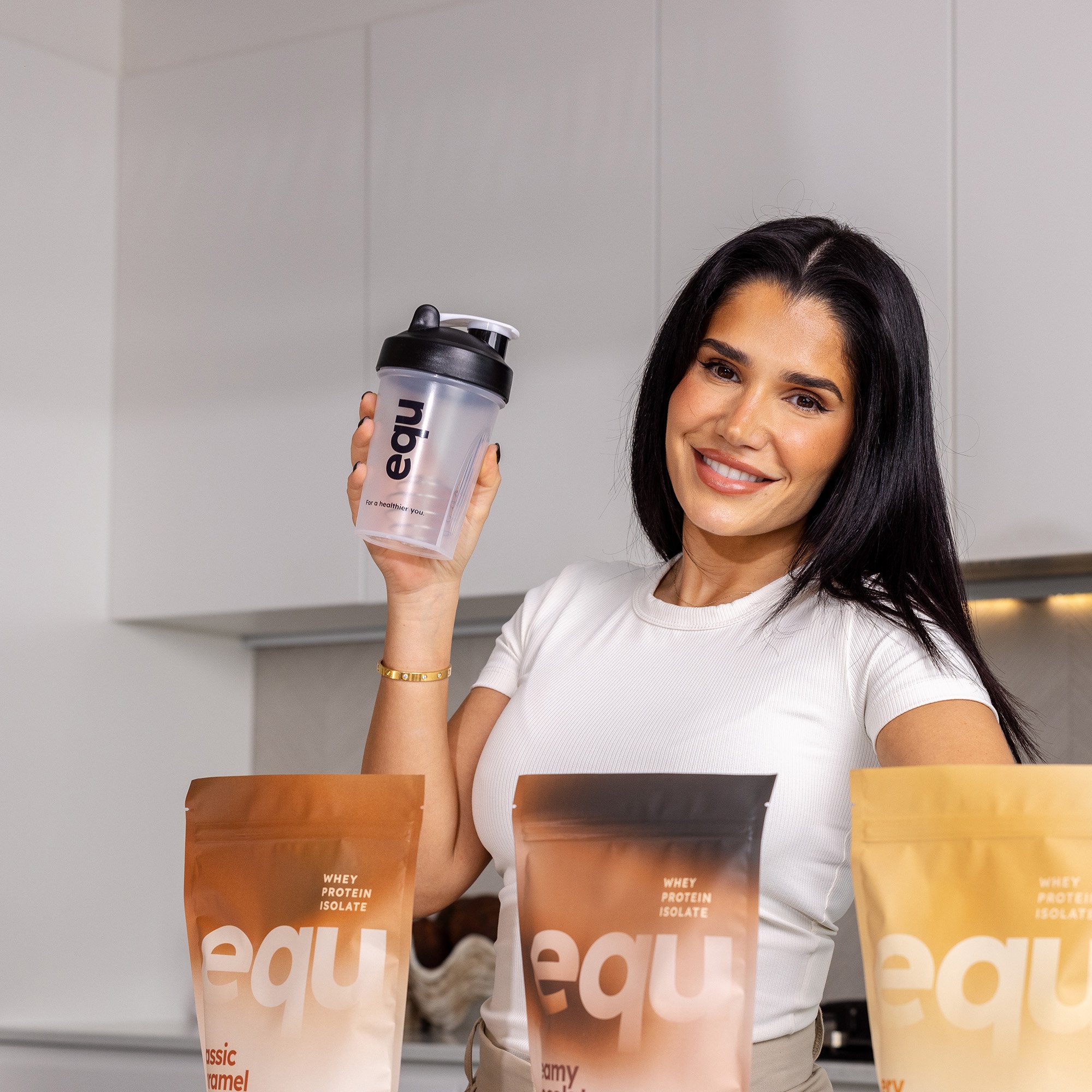
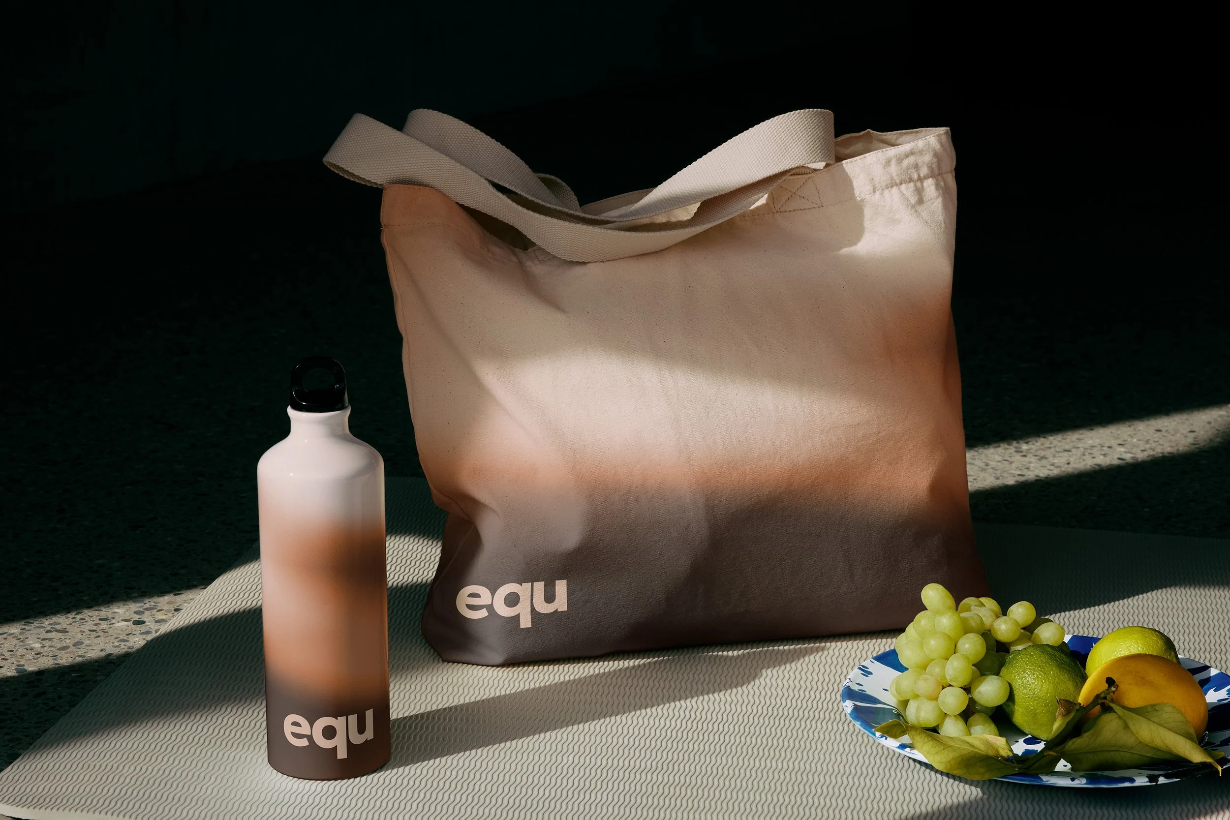
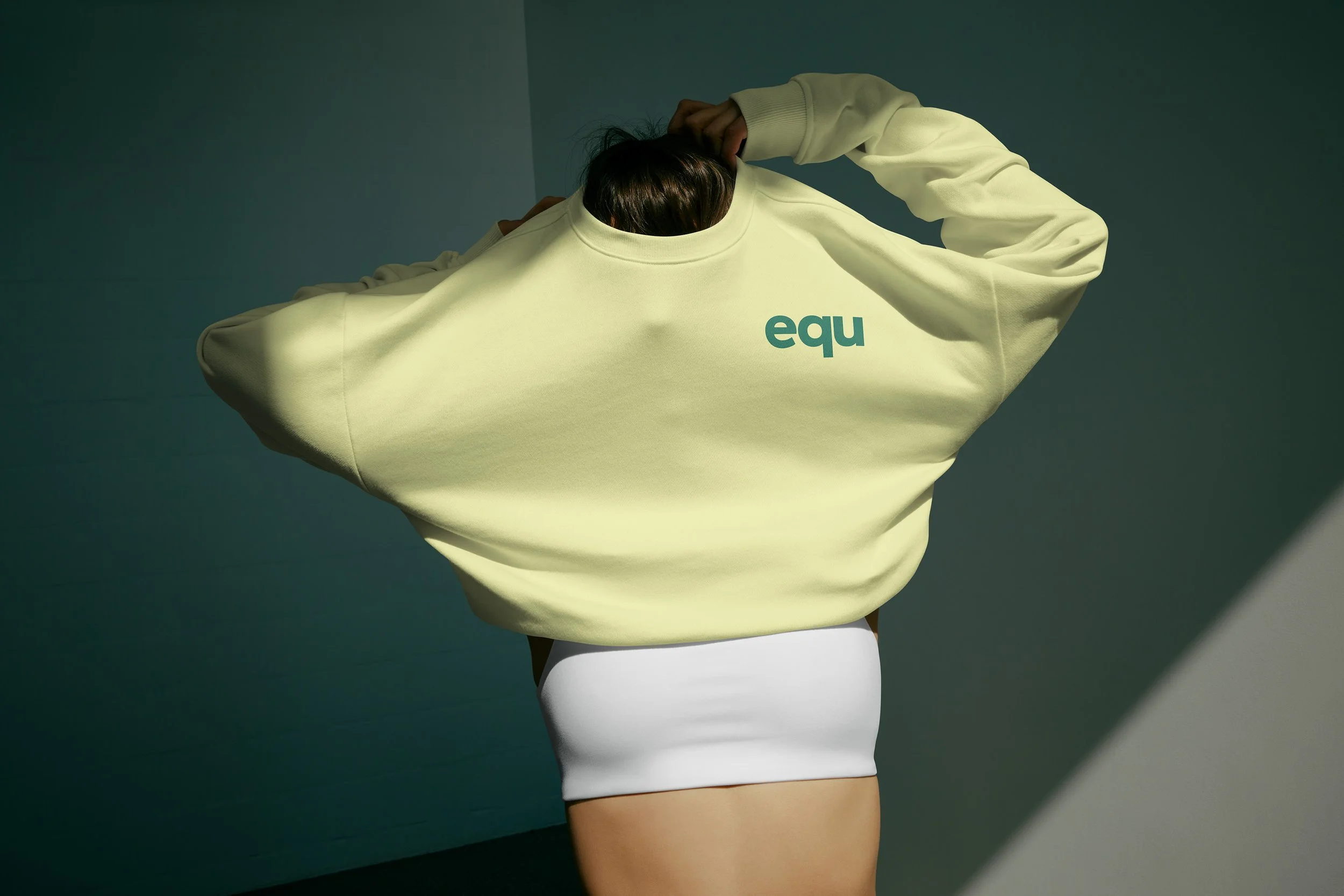
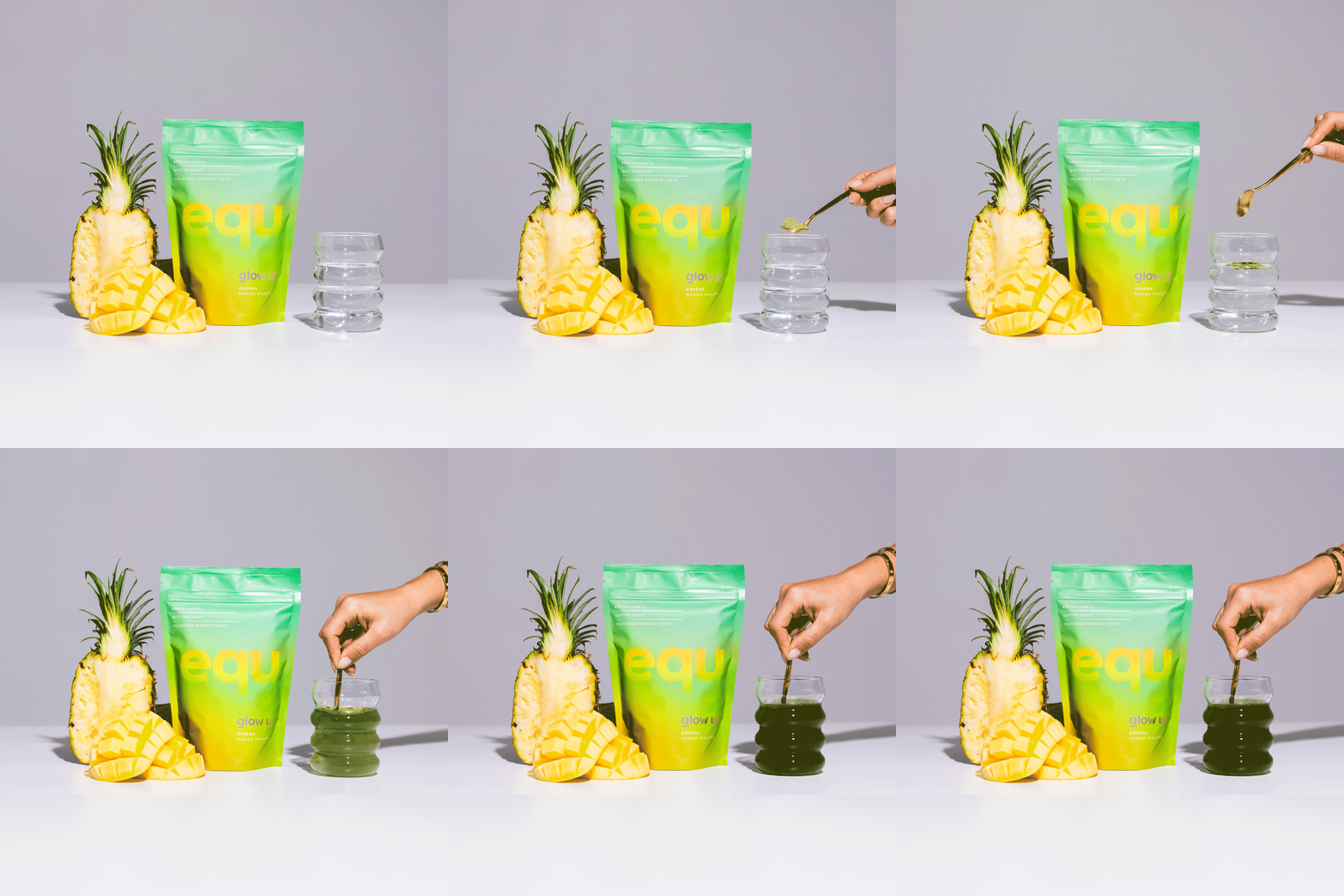
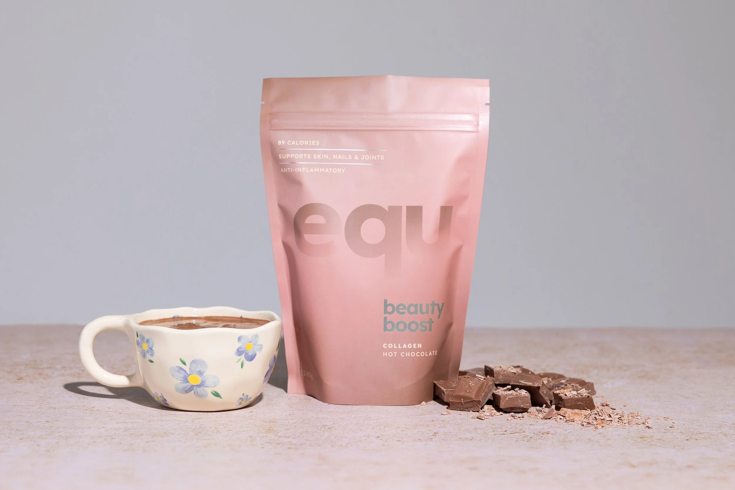
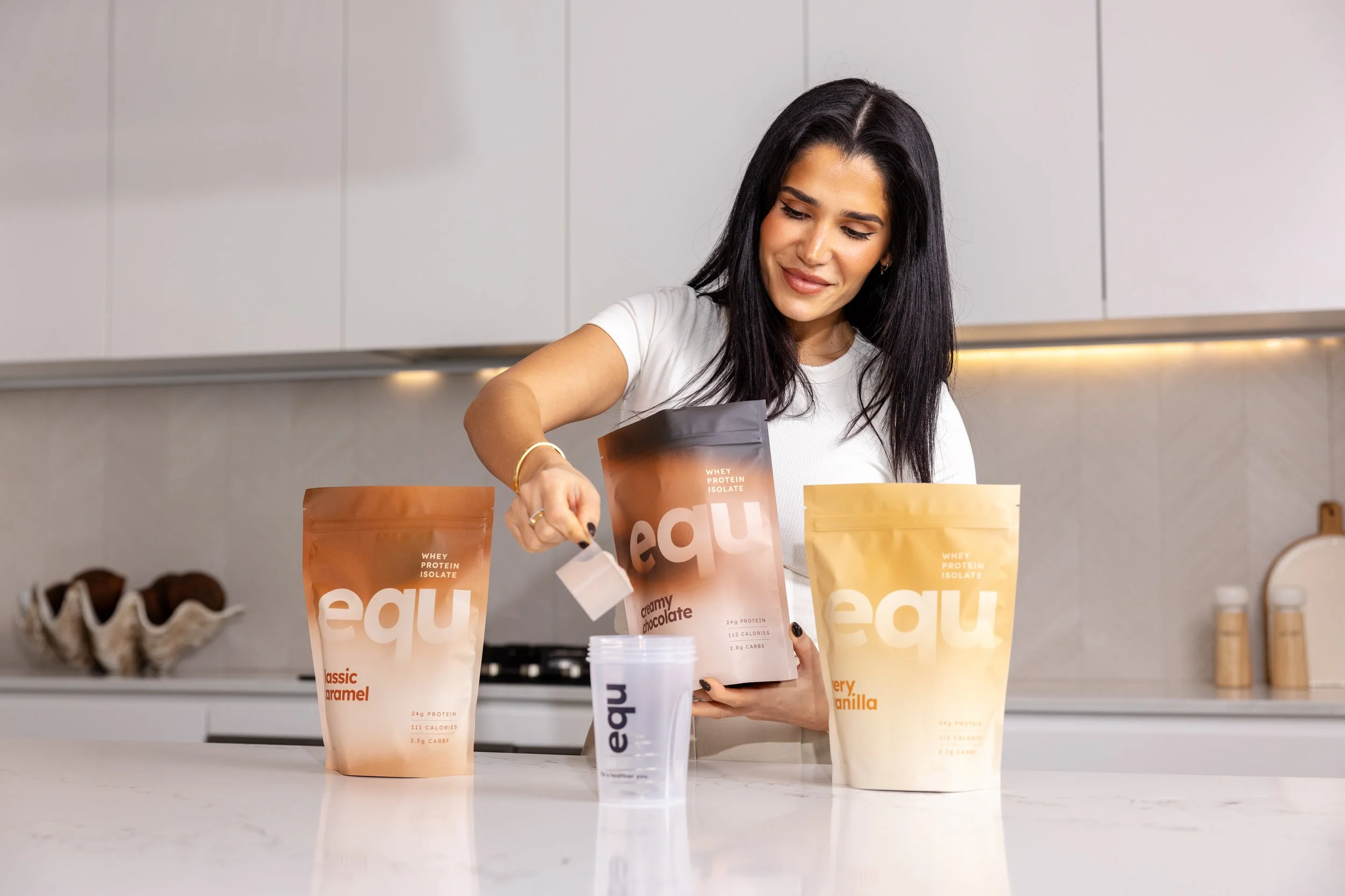
The sports nutrition category is visually relentless. Bold, masculine, loud, it speaks to one type of consumer and largely ignores everyone else. For equ, a brand built around balance and a community that skews toward a more considered, health-conscious audience, that visual language was never going to work. The packaging needed to feel like equ: refined, real and free from the noise.
Our solution
We developed a suite of packaging solutions for the equ consumer range that broke deliberately from category convention. The design language is chic and contemporary, with a restrained palette and considered typography that communicates quality and credibility without relying on the visual shortcuts the category leans on. Every decision was made with the equ community in mind, an audience that reads labels, knows what they want, and responds to honesty over hype.
The outcome
The result is a consumer product range that feels like a natural extension of a brand people already know and trust. By designing against the grain of the category, equ's packaging stands apart on shelf and online, attractive to both its existing community and the broader, more discerning audience the brand is ready to speak to.